ALREADY DEAD began as a media group based in New York City. I was brought on to design the original logo back in 2017. The project failed, but I wanted to revisit the name and concept to improve on the client's original ask.
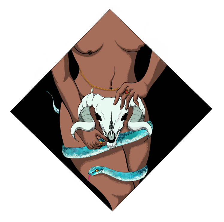
The original logo was a conceptual mess. I was a fresh designer, unfamiliar with dealing with difficult clients and new to designing logos. I was uncomfortable with guiding the client based on my knowledge, which led to a "logo" that was more of an illustration than a usable logo.
Armed with experience and new knowledge, I reached out to the original clients to see if they might be interested in exploring the concept from a new angle. They agreed, and we began discussions on what went wrong with the first logo and how we might resolve those issues. We settled on three key areas of failure:
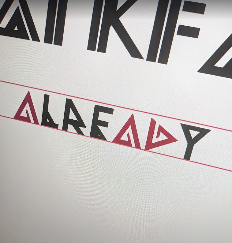
1. READABILITY: The first concept was too cluttered and unreadable. It functions more as a illustration rather than a proper logo.
2. IDENTITY: The original concept has too many elements-- the woman, the skull, and the snake-- that all fight for the audience's attention. There is nothing connecting these elements to each other, or the company as a whole.
3. DIRECTION: The company as a whole didn't have a strong artistic direction, largely due to the first two issues. If we could find a way to resolve the first two, we would be able to craft an artistic direction and brand for the entire company.
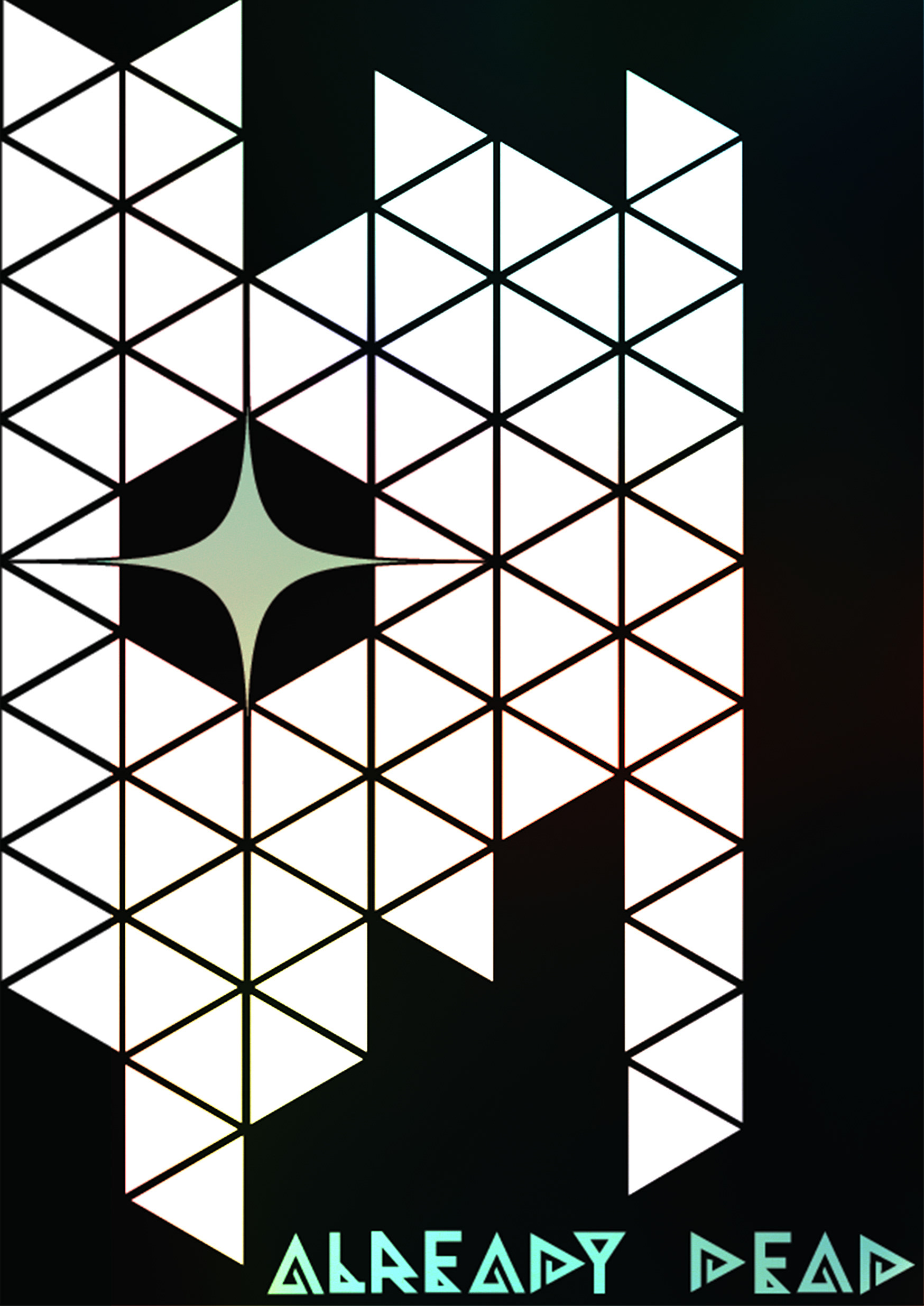
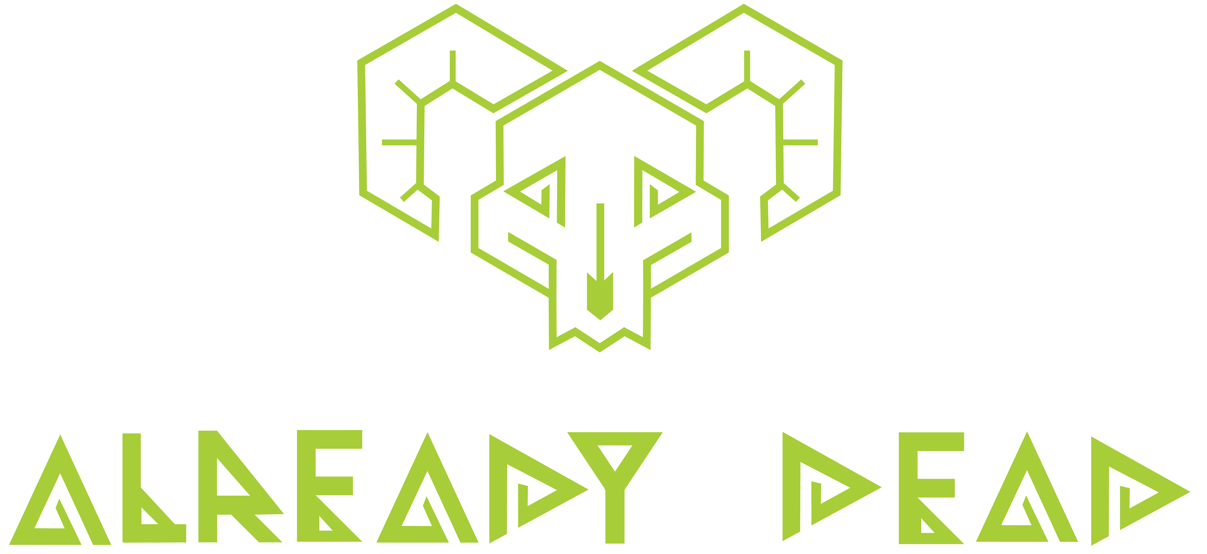
My first goal was to create a custom font for the new project. I had an idea in mind after seeing some geometric style fonts, and I thought it would work well here.
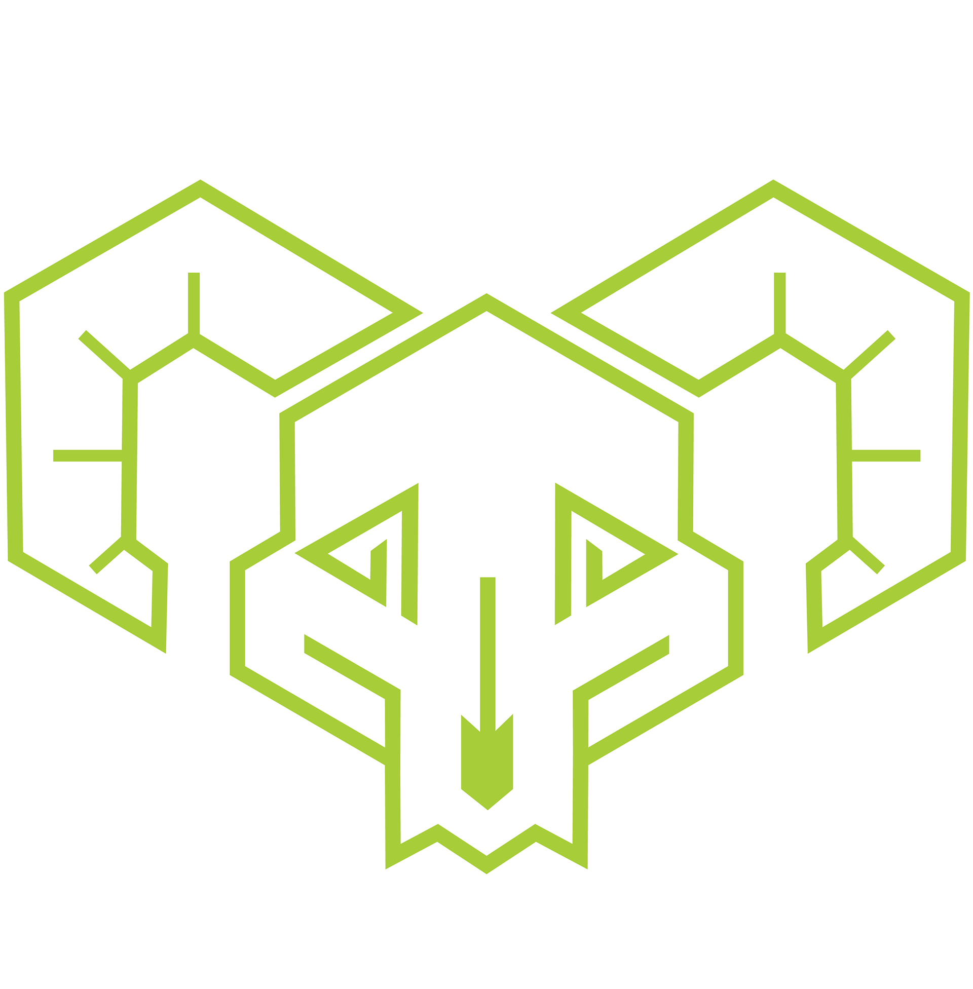
The idea centered around the similarities that could be constructed between the letters "A" and "D", if they were properly stylized. This required some experimentation, as well as the use of the font Moonlight as a base. It also shaped the rest of the branding, as crafting the "A" and "D" to look similar led me down a path of sharp, triangular shape language.
The rest of the font would, of course, need to follow suit. Thus, I created the six letters I would need to complete the logo using Illustrator. The original plan was to have the "D" simply be a rotated "A" but I soon discovered that the proportions would be wrong, and so was forced to alter the design slightly.
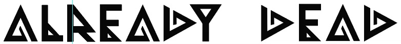
The altered "D" is made of slightly thicker lines than the "A", but at a glance they still appear to be rotated versions of one another. In actuality, they are also mirrored, a choice I made to both better differentiate them and to incorporated them into the logomark as well.
Experimenting with the angles
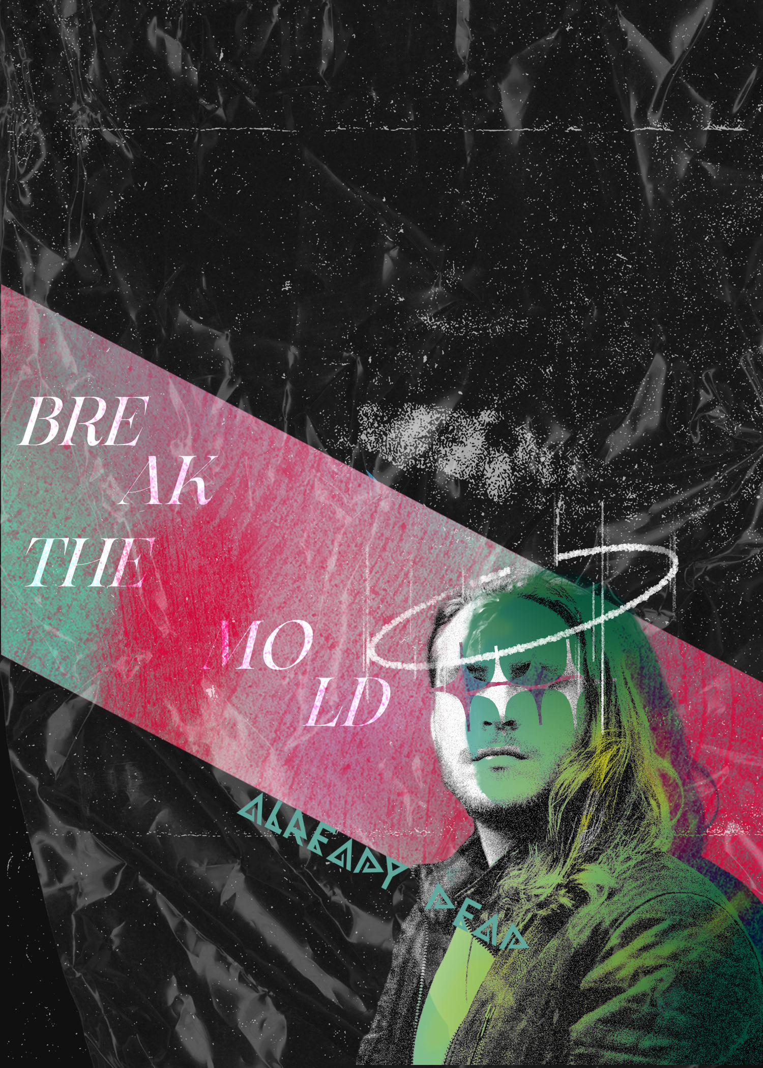
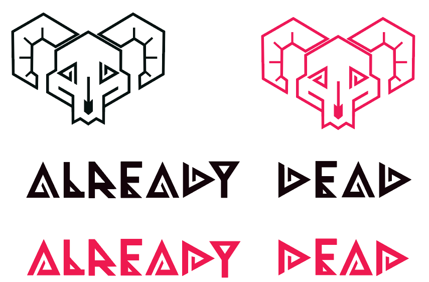
In the end, I created a design that would allow me to repurpose the shape of the "A" and "E" as "eye sockets" in the skull of the ram. This would allow me to take one of the original elements from the initial concept and modernize it for this new challenge. The final design takes the "A" from the BLACK version above and the "D" from the RED version.
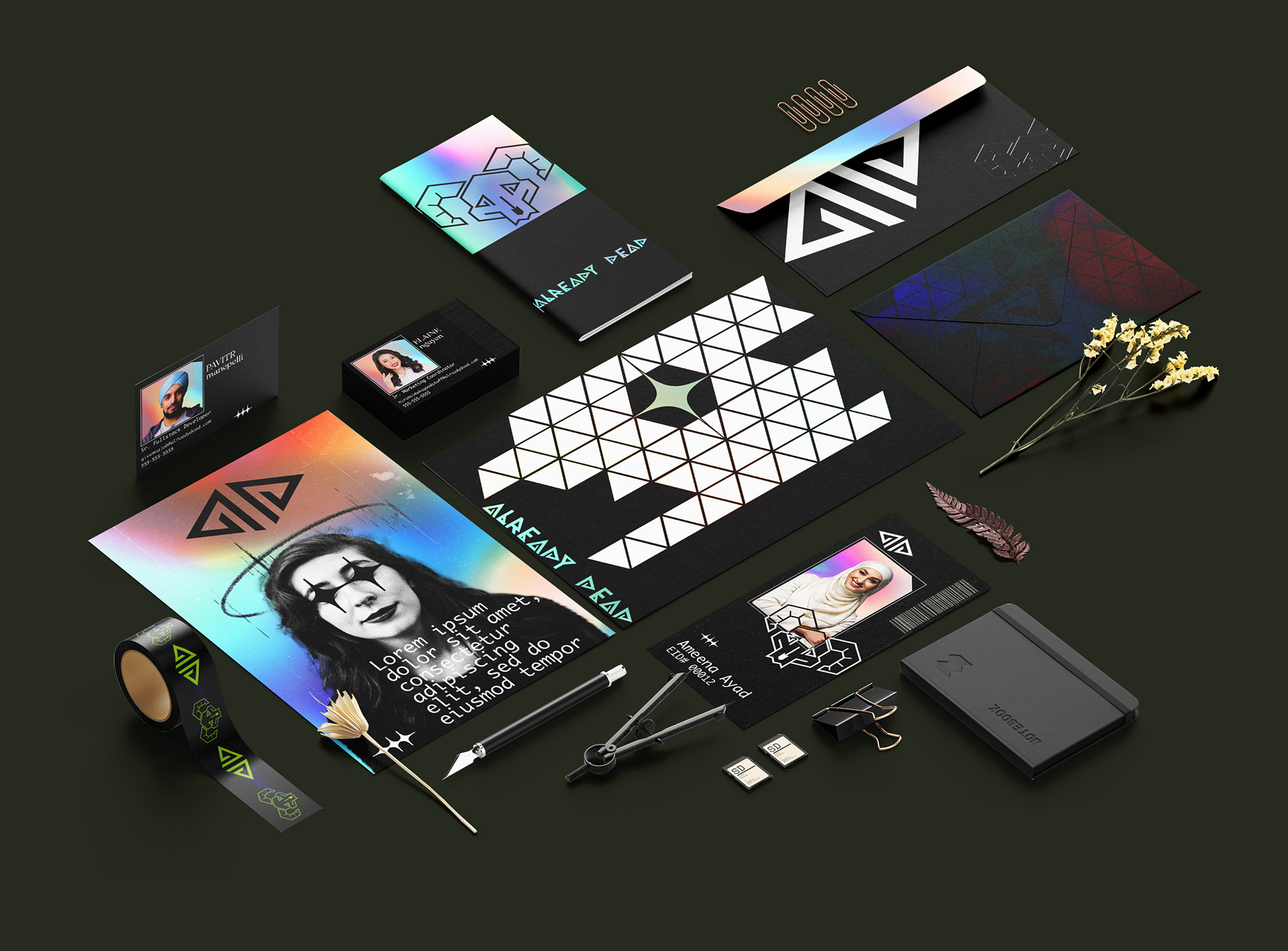
The skull design was made geometric in order to maintain a visual consistency with the new font. I wanted to incorporate the "A" and the "D" into the skull itself in the event the logo would need to be implemented without the text. This also presented the opportunity to create an icon that consisted of the "AD" shapes, oriented in such a way as to evoke the image of a rams skull. These three elements were integral to creating a responsive logo that remained consistent throughout its forms.
Skull logo with "A" and "D" as the eyes
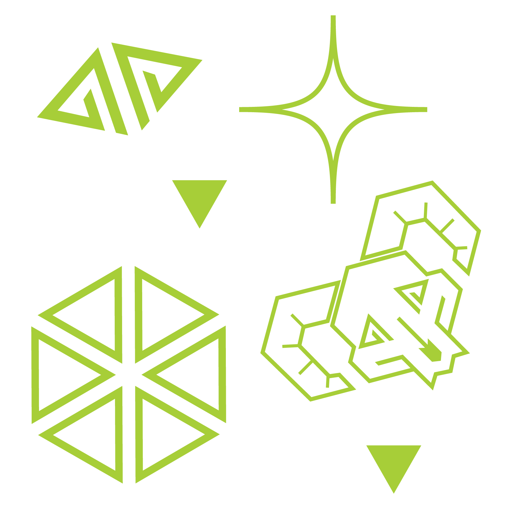
Brand pattern, with full skull and "AD" skull icon
"AD" skull icon wallpaper
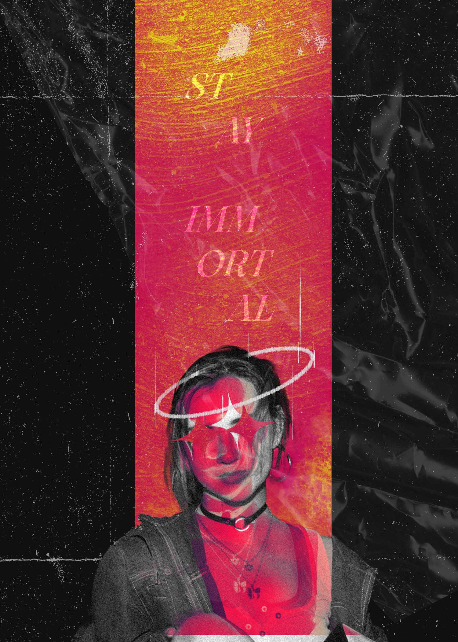
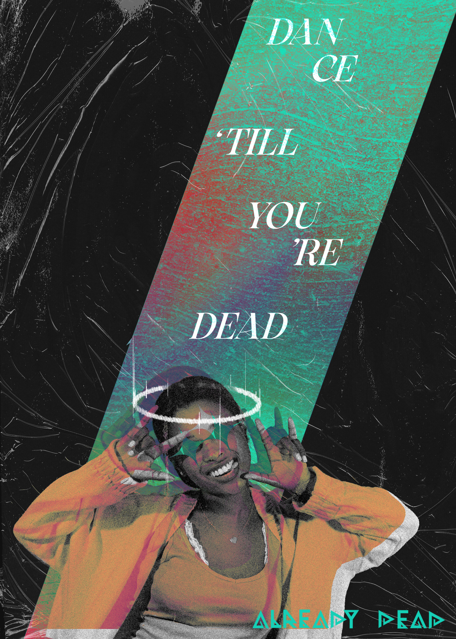
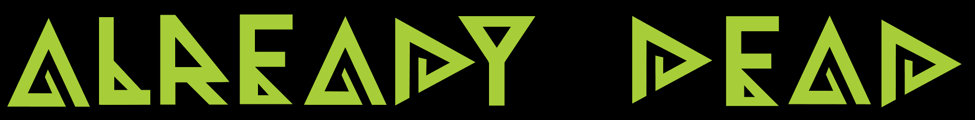
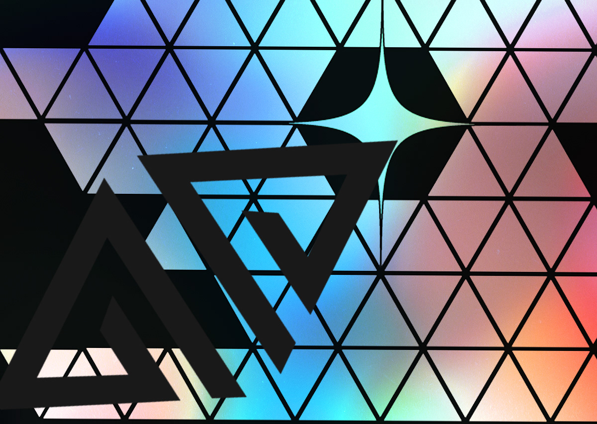
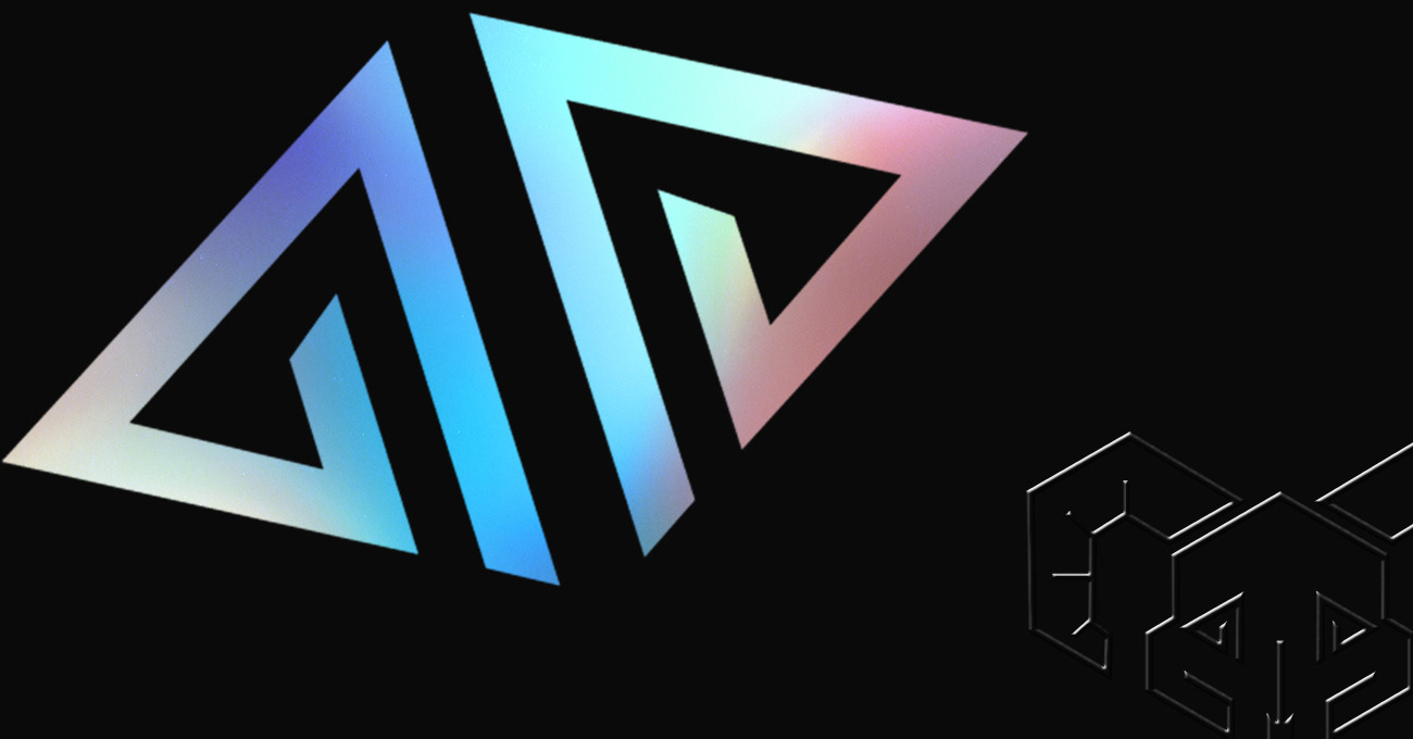
After finalizing the logo itself, I wanted to explore colours and brand feel.