STARSHIP
I created these for an Atlanta-based sexual health company, Starship. They wanted to rebrand as a more classy and upscale establishment, more centered around women's sexual health and wellness, and this was my idea on how to take them in that direction.
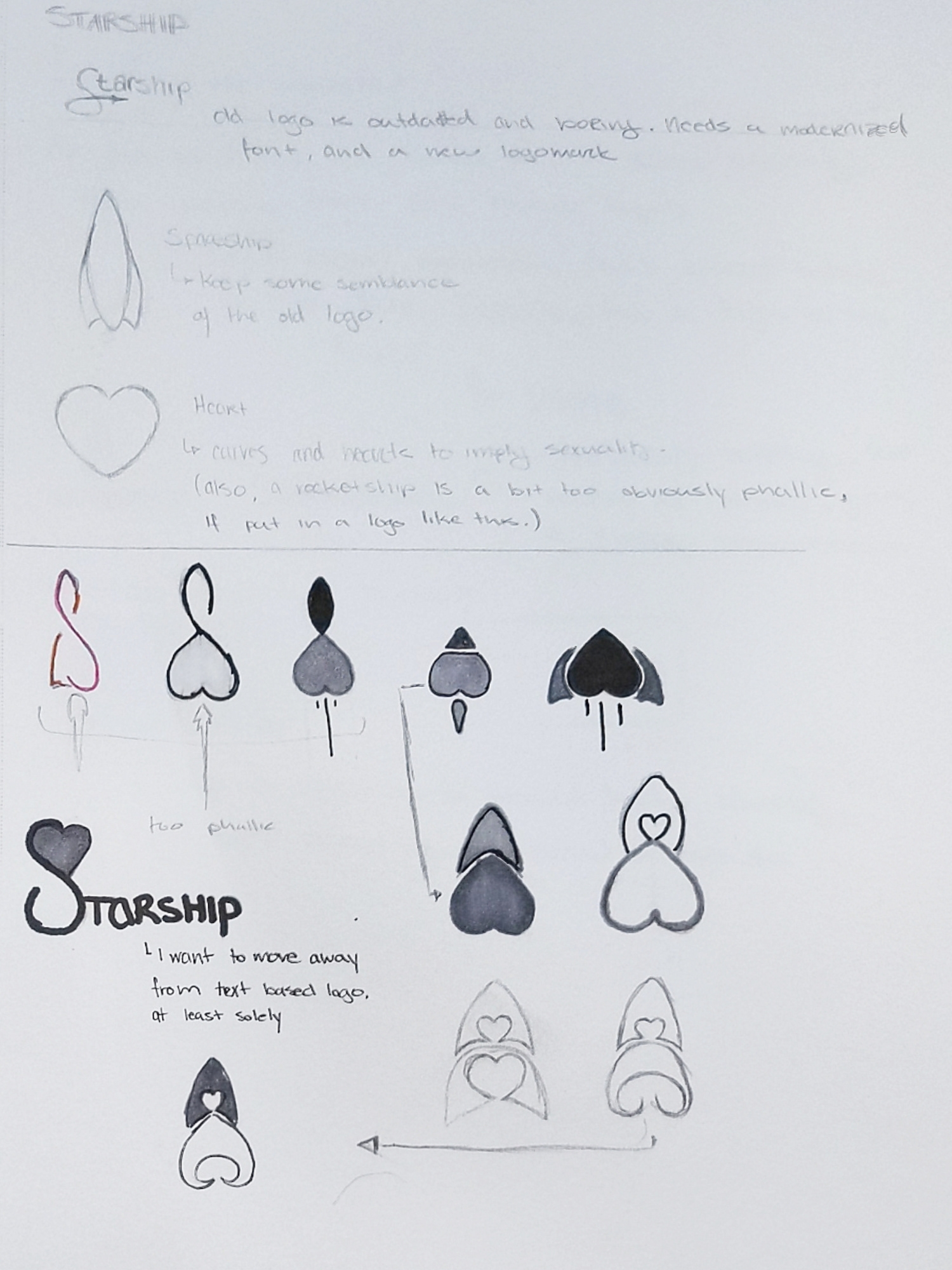
I began with quick sketches of a new logo. The first element I wanted to incorporate was the rocket ship. The next was a heart, which
The challenge came in designing a rocket that, when seen in conjunction with the nature of the business, wouldn't read as inappropriate.
I chose to convey the nature of the business in subtle ways by emphasizing hearts and curves: things that can be read as sensual and sexual without being overt or potentially offensive.
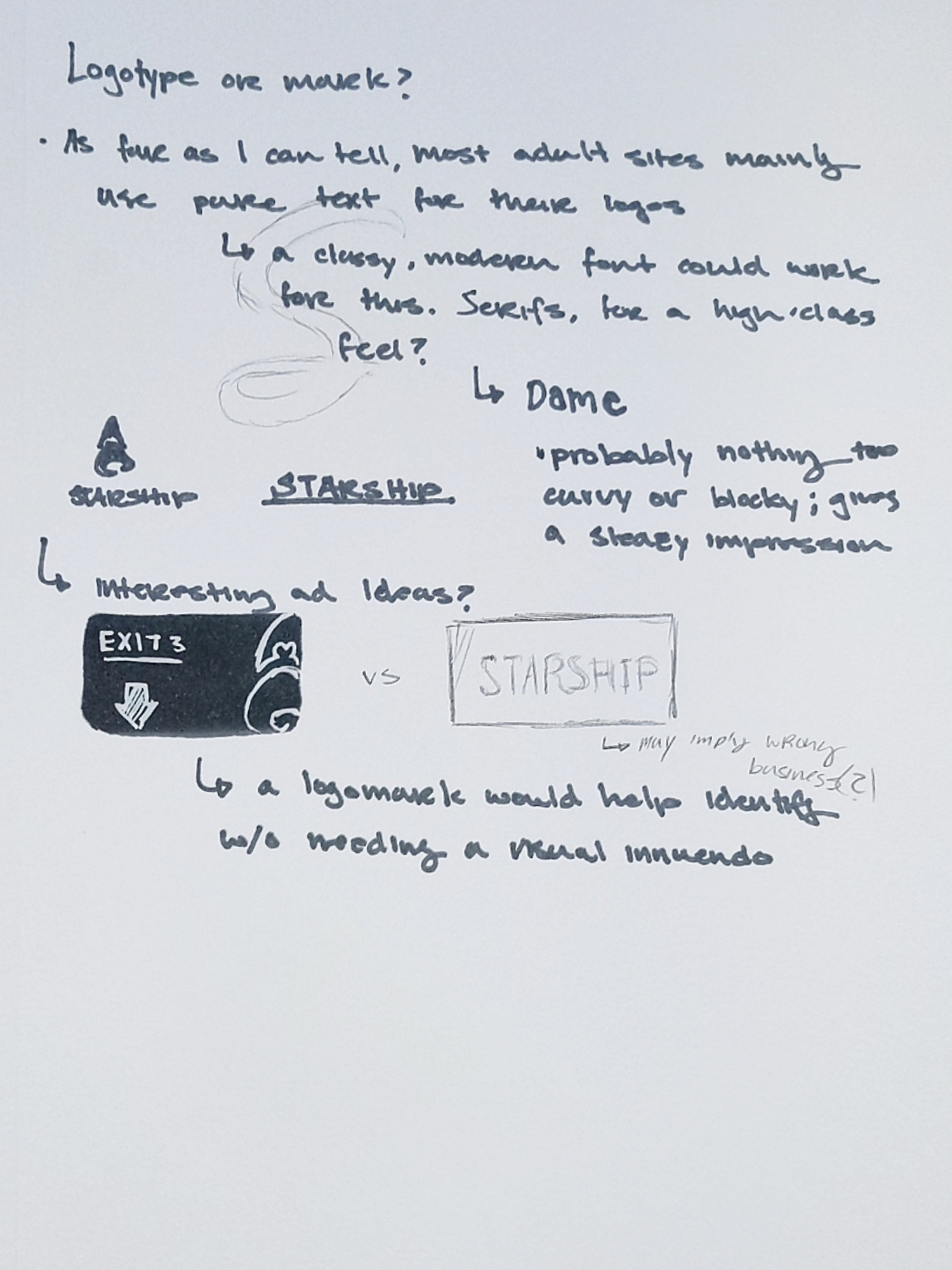
The goal was to move away from words or emotions typically associated with Starship locations (ie. "sleazy", "creepy", "perverted").
A large percentage of their merchandise is women's toys, so they wanted a design and aesthetic that was more welcoming to their primary demographic.
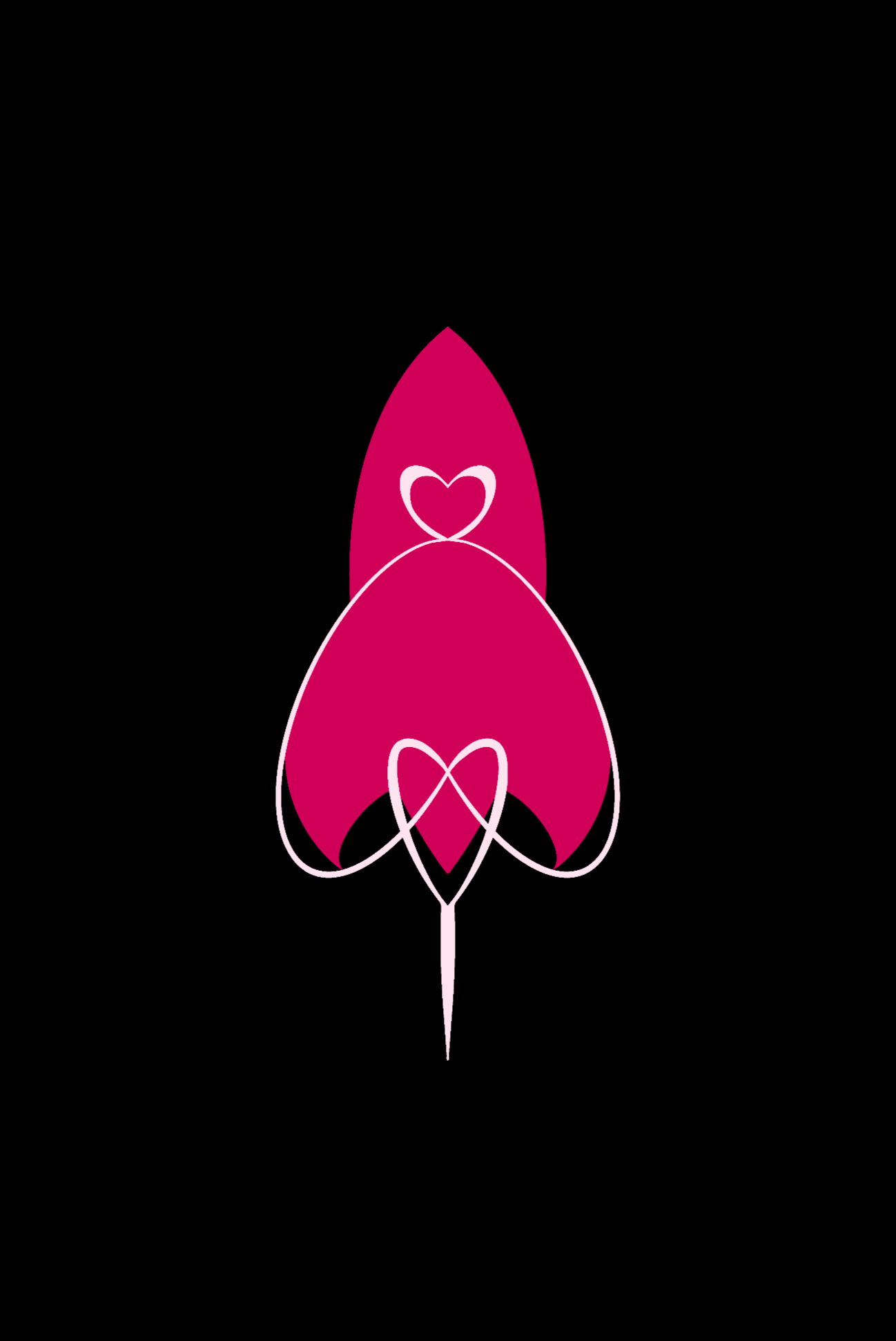
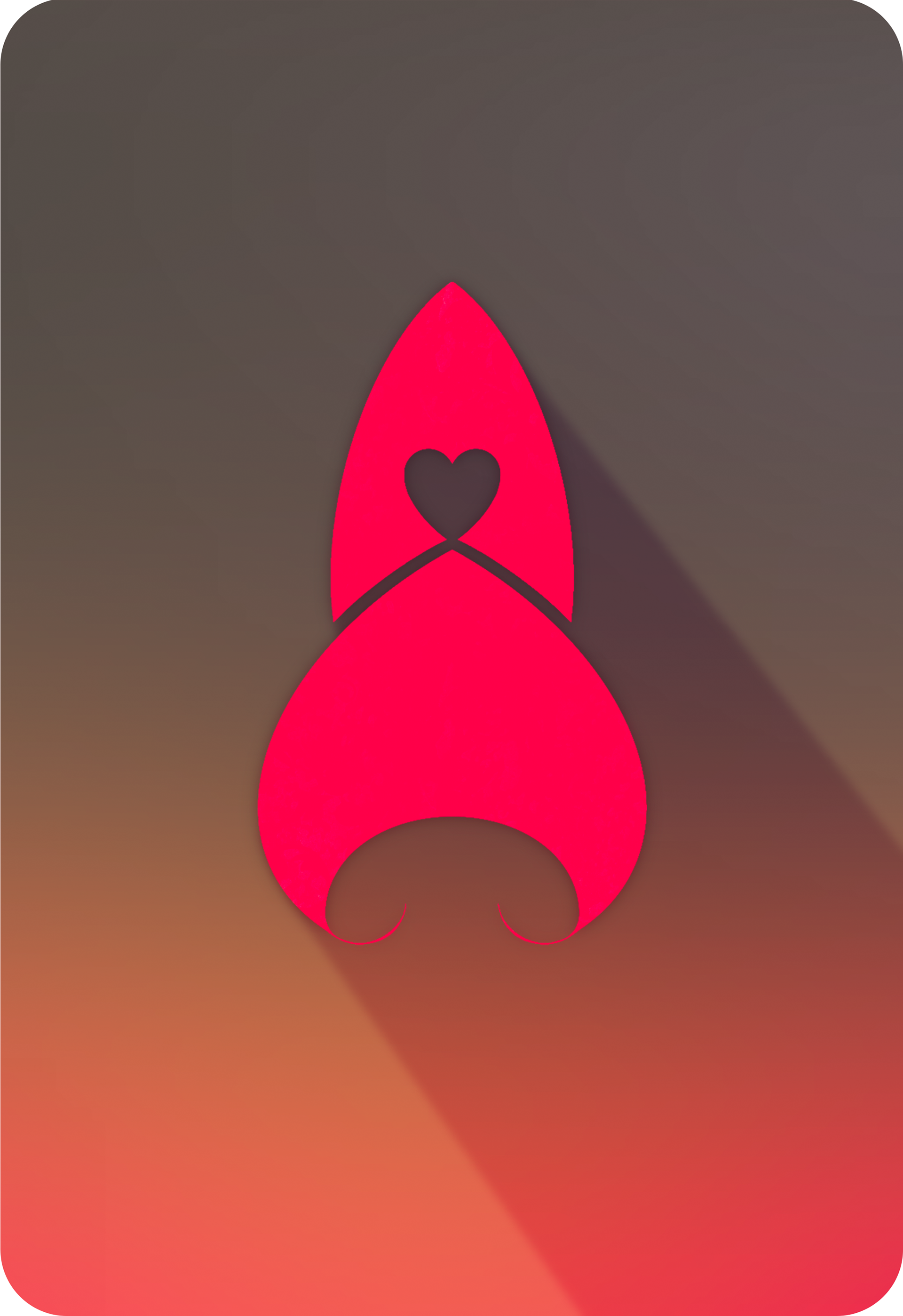
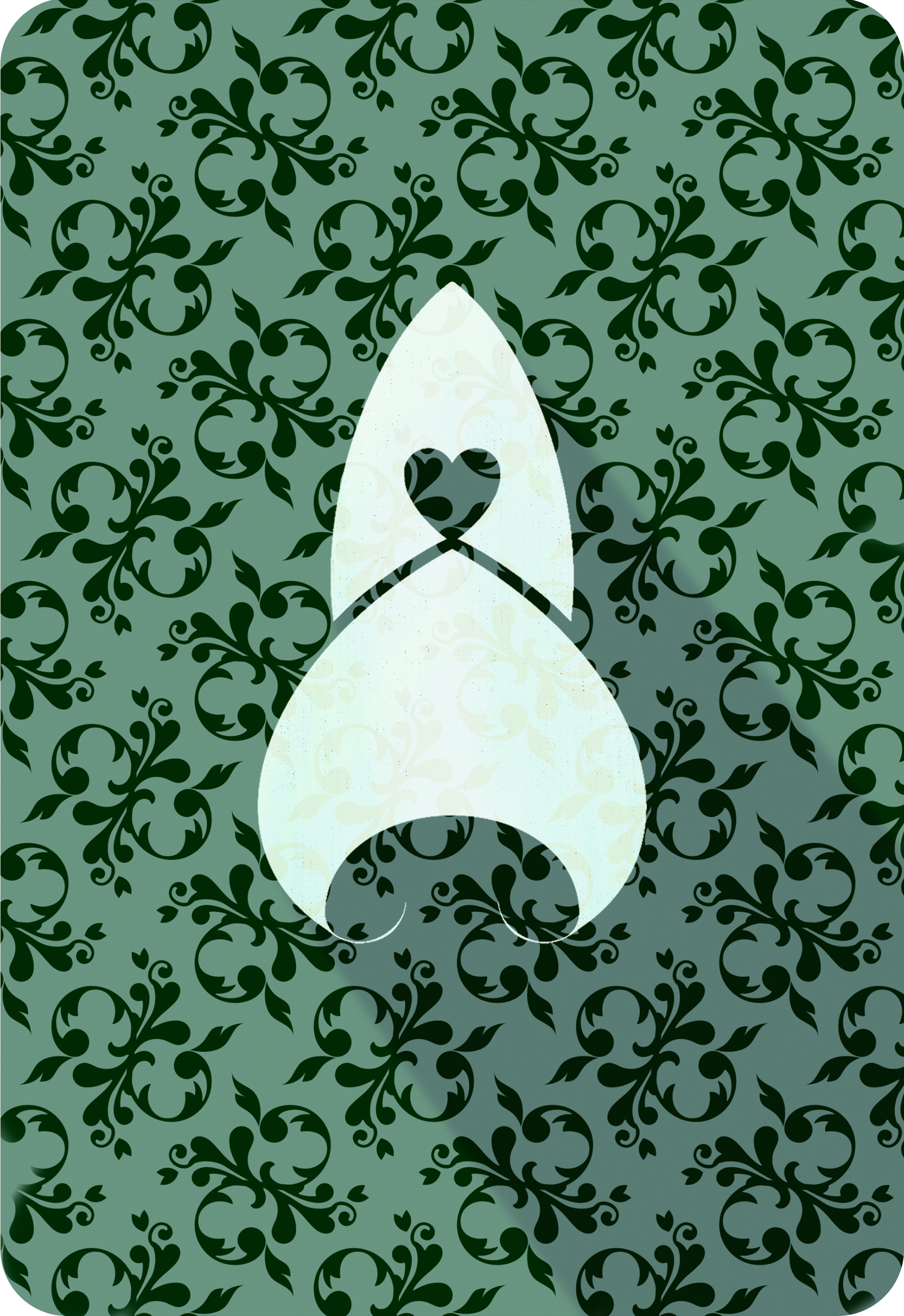
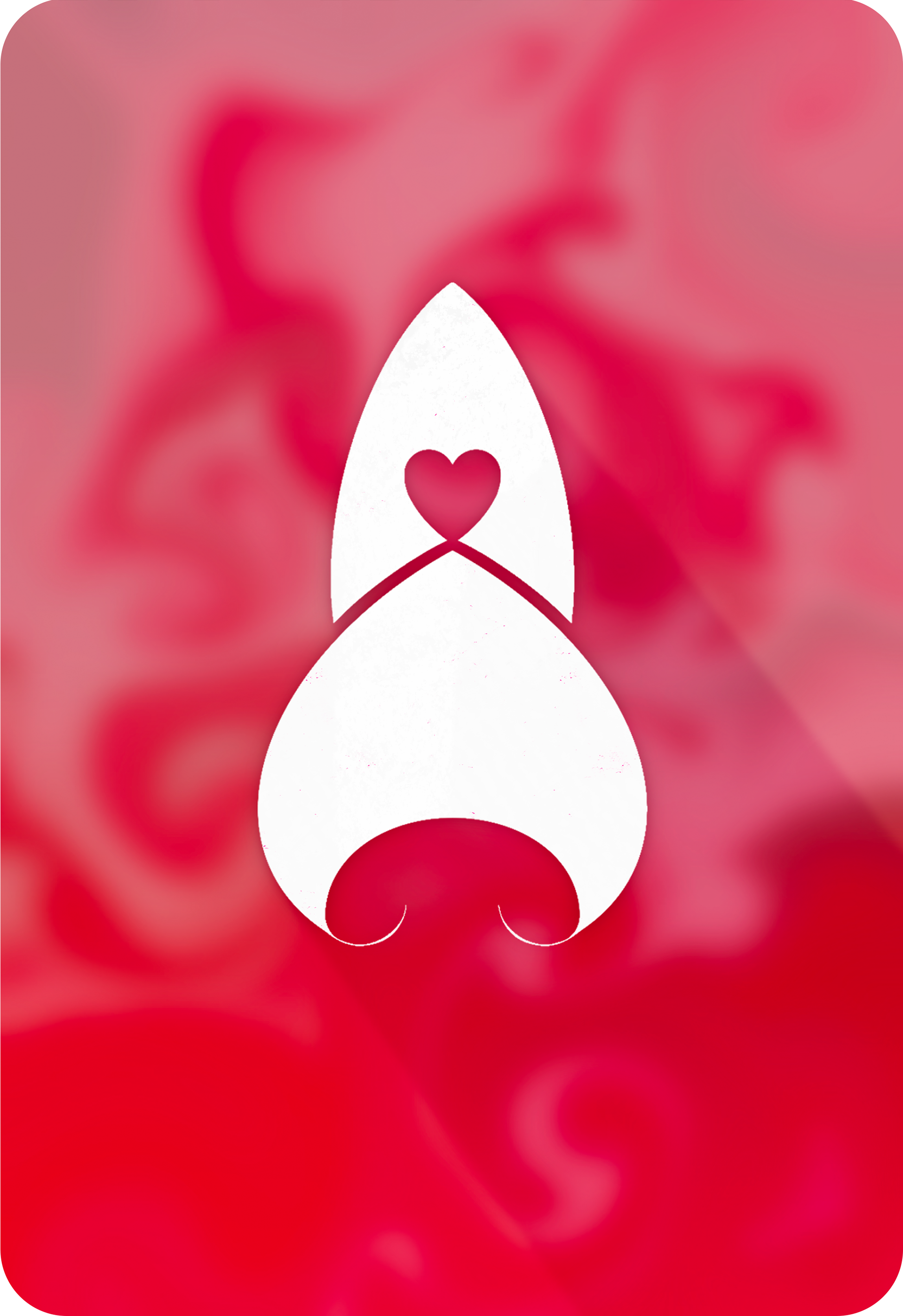
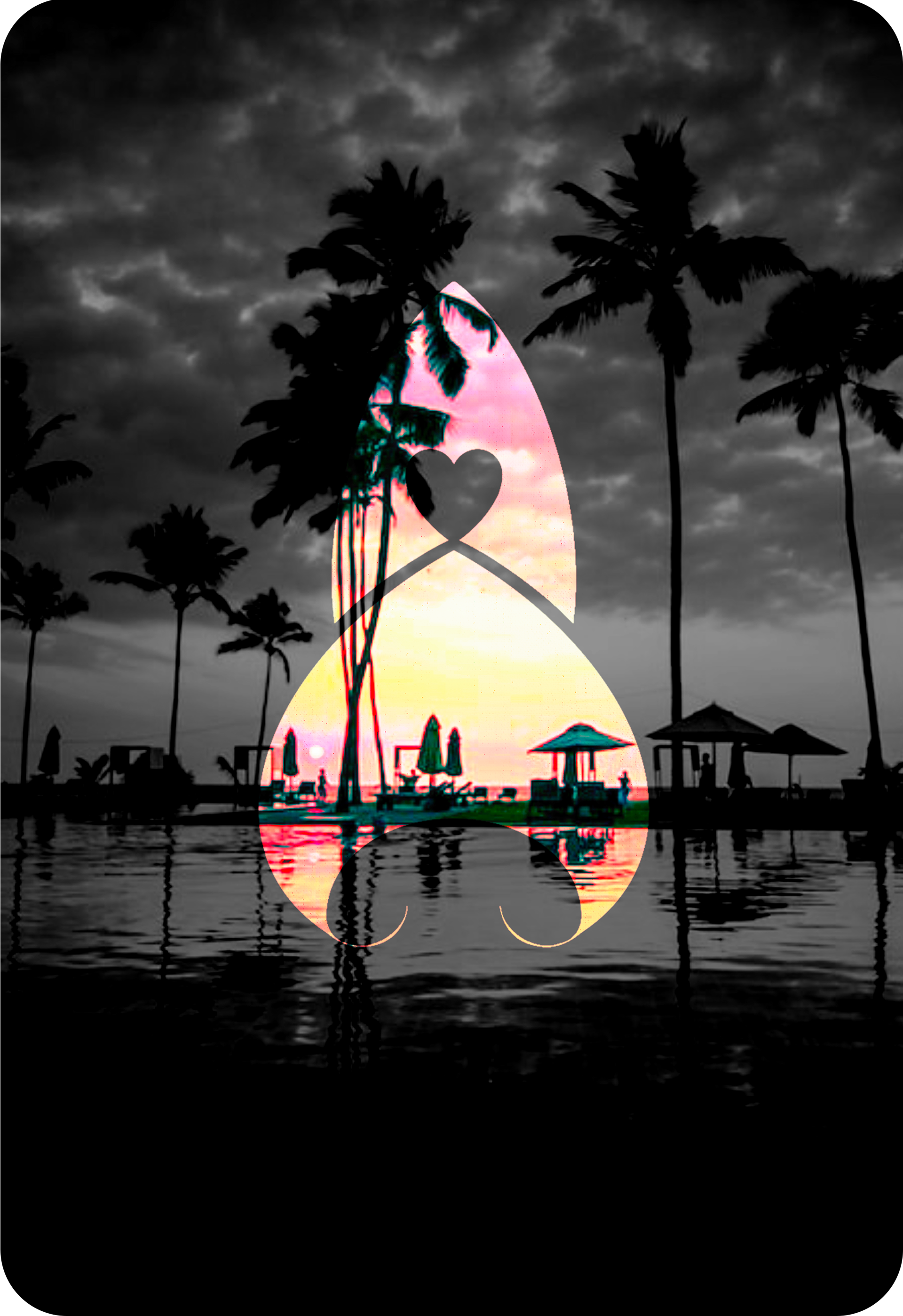
Eventually, I settled on this design: a ship with prominent heart shapes. The pink color would be associated with passion and intimacy.
The lower half of the ship is reminiscent of a heart, while also invoking a devil's tail-- implying a sinful, seductive side.
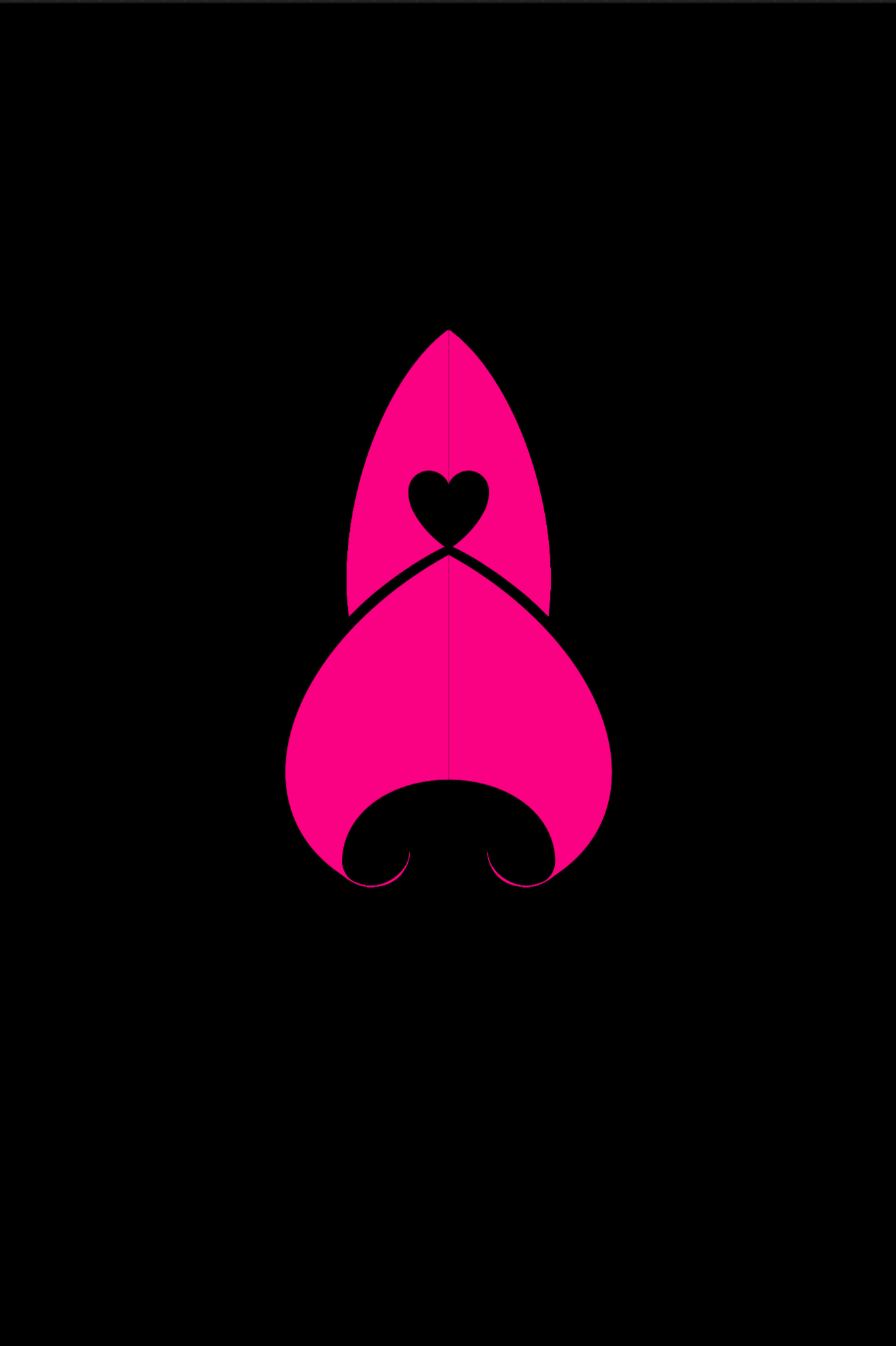
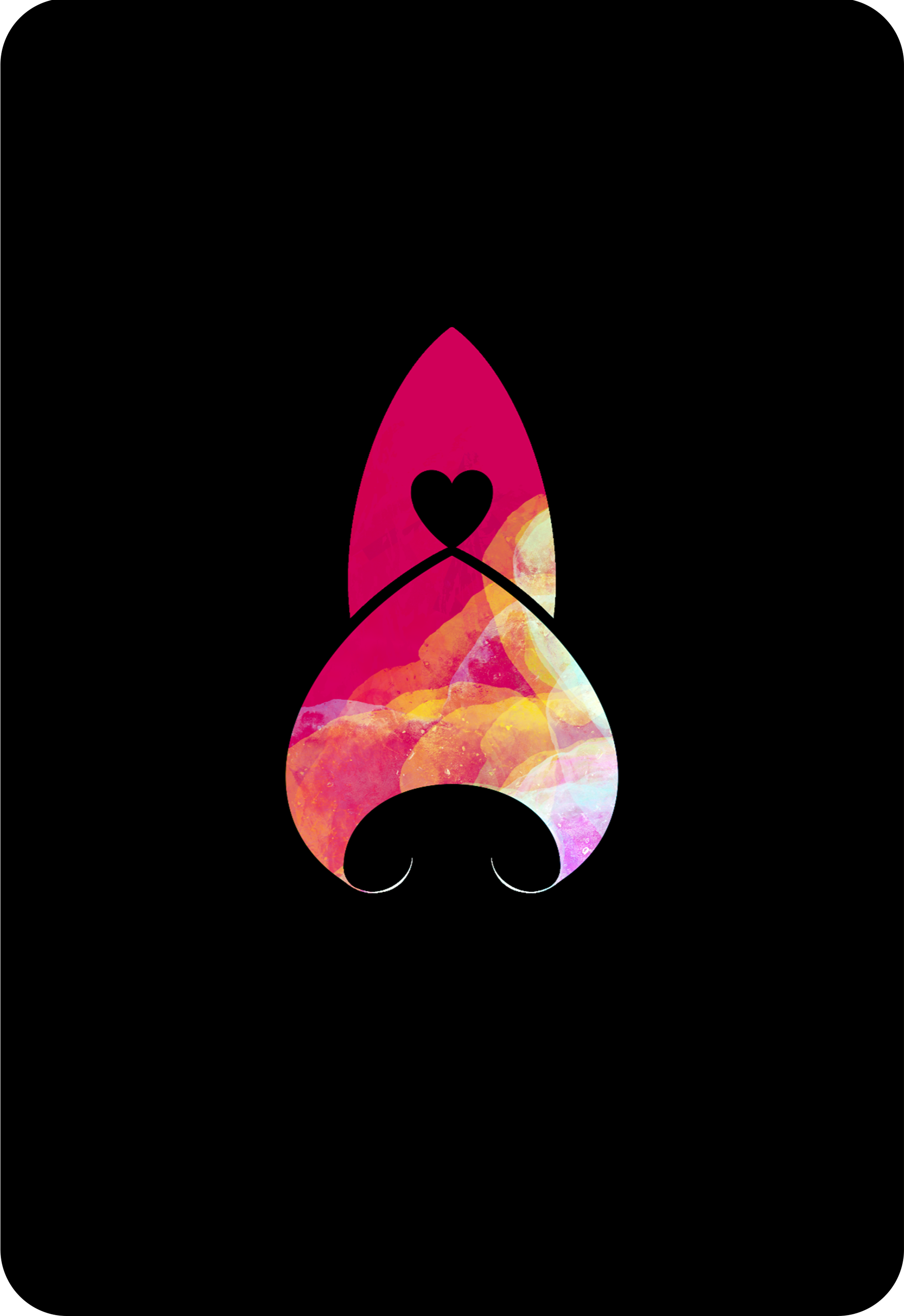
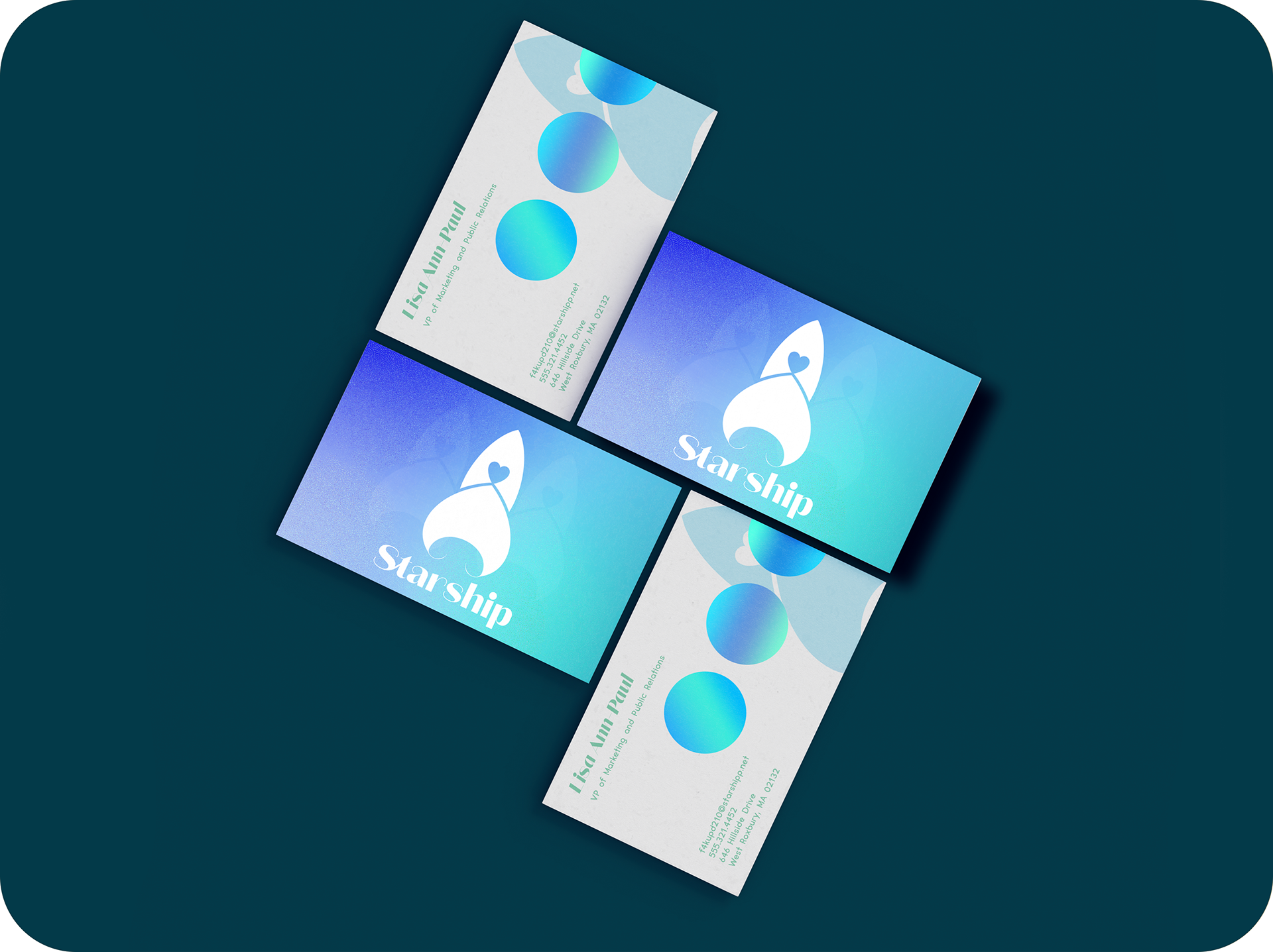
I tried the new mark in a variety of scenarios. I wanted it to be versatile, maintaining brand recognition even when used in themed ads, such as a holiday or specialized ad campaign. While the solid pink version was to be the primary, the shape was the most important part.

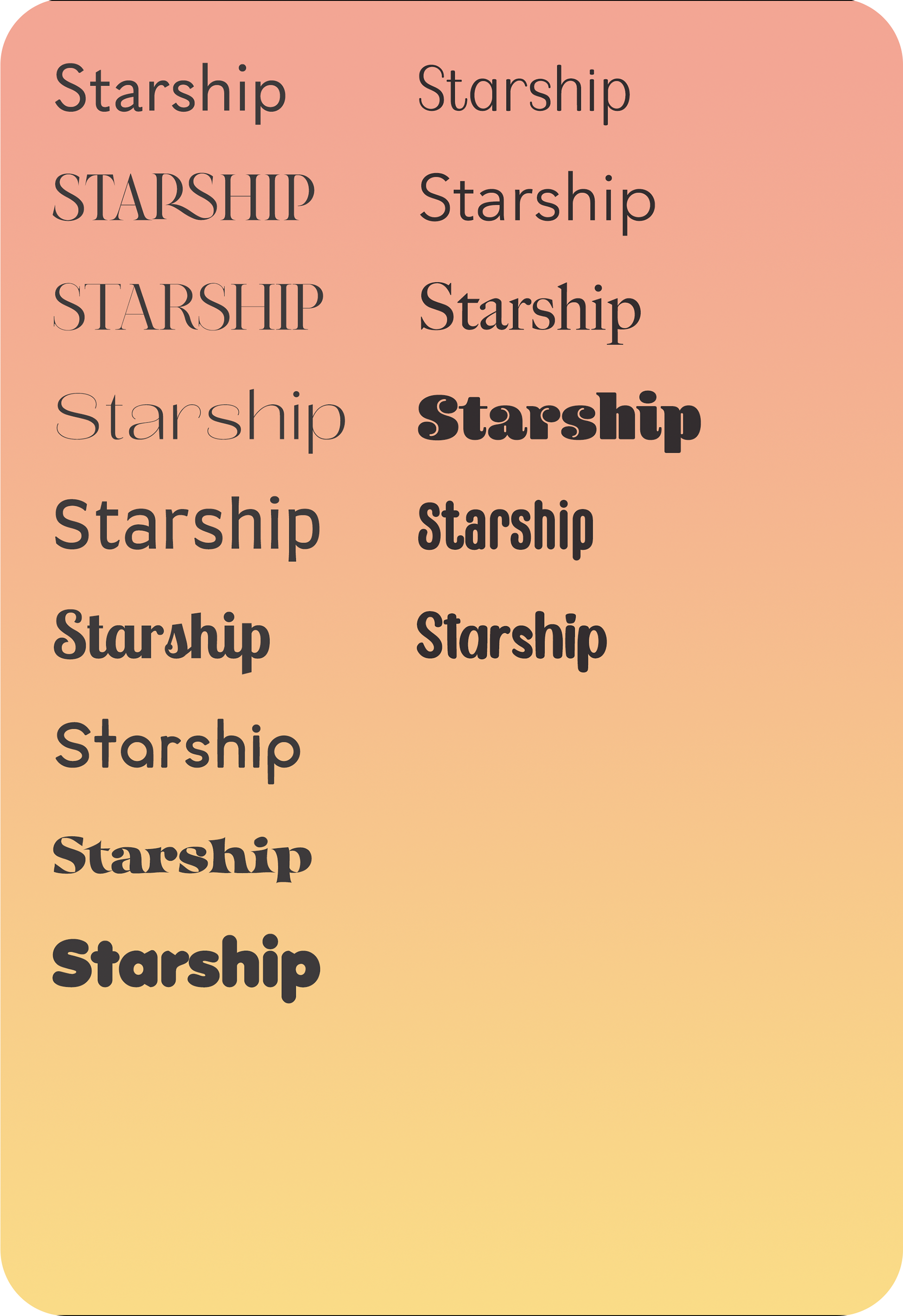
Next I focused on choosing a new font for the logotype. I played around with ideas like "luxury", "inviting", "romantic", and "seductive".
The old font had a very dated feel to it, and I felt a sleek, more modern look would serve well.
I tried to avoid monowidth fonts, as I felt they would feel too plain and lack the sophisticated feel I was seeking.
I chose several possible options, narrowing them down over a period of time.

Adobe CC "LUST SANS"
I chose Adobe's Lust Sans and added some embellishments. I felt the font found a sweet spot between classy and modern.
It also had an appropriately thematic name, which I thought was clever and fun, though no potential consumer would be aware.
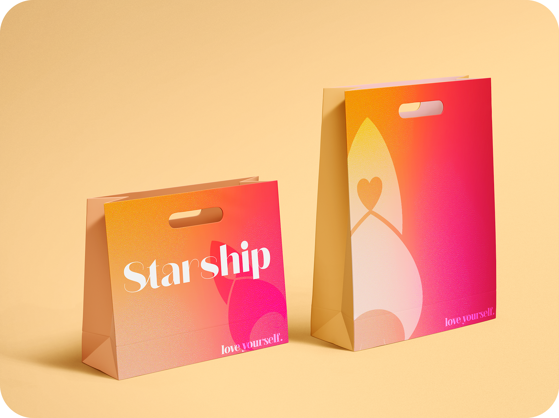
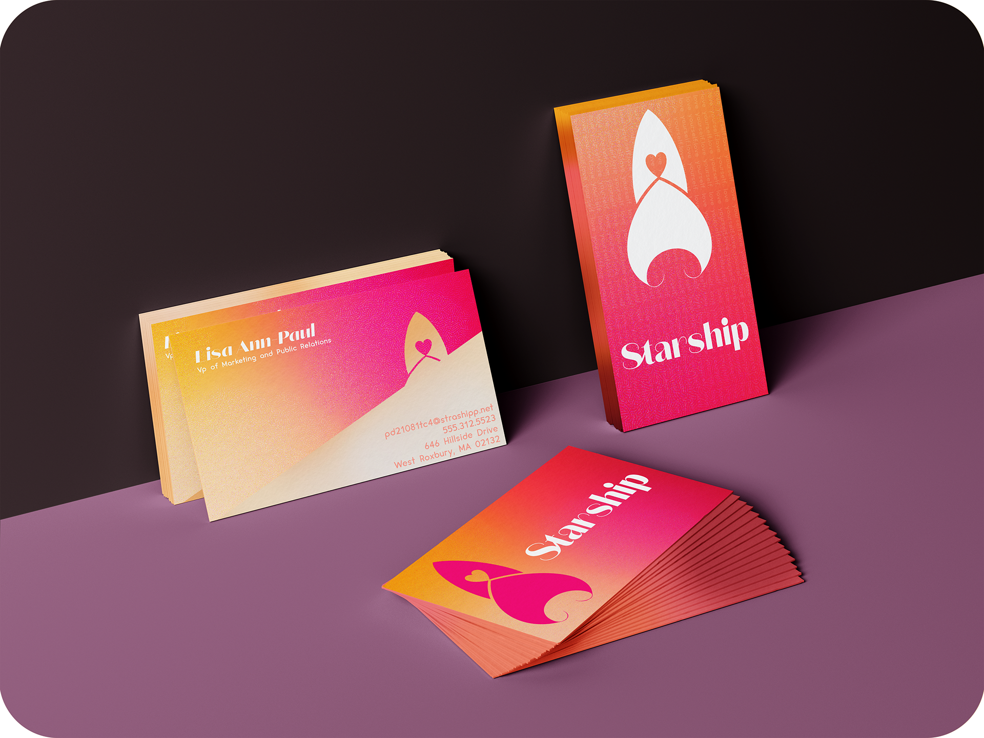
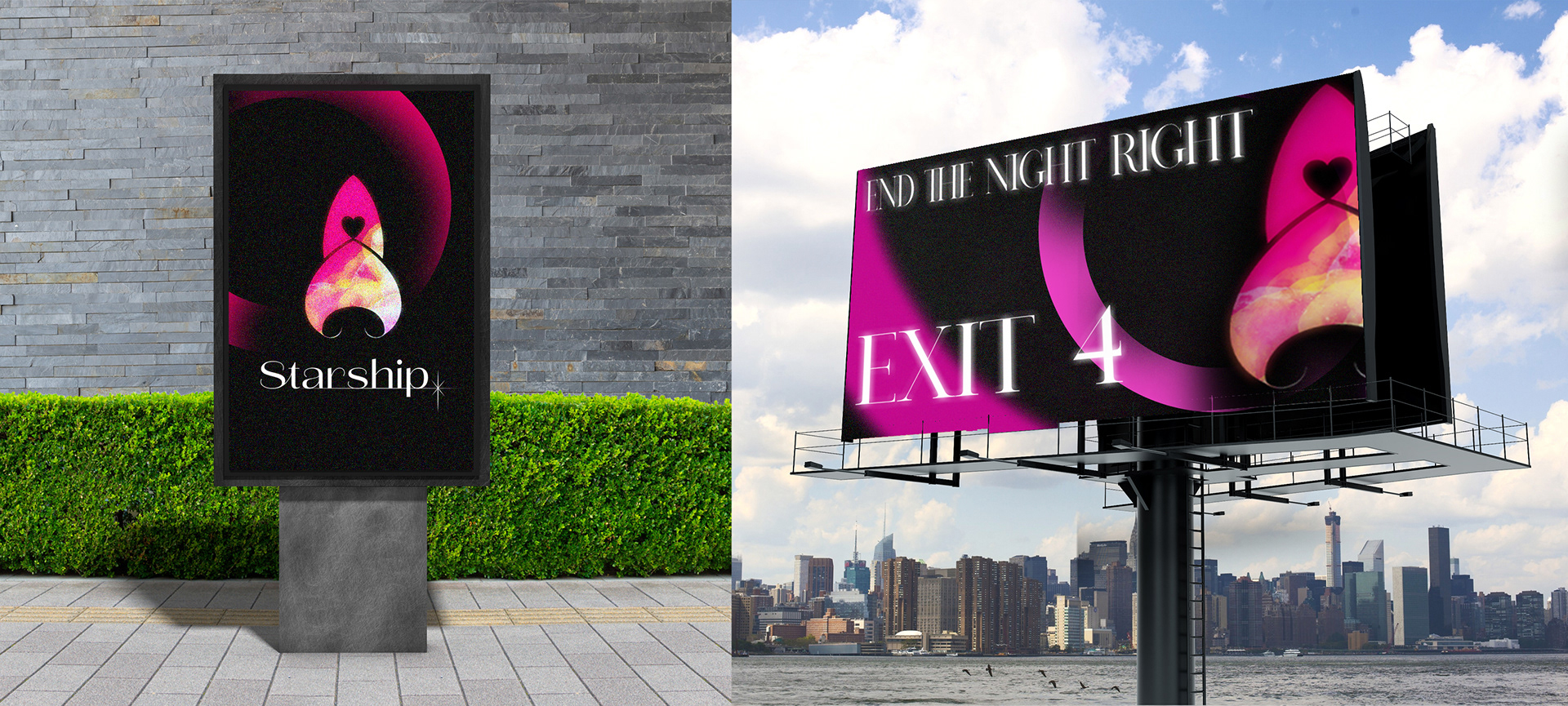
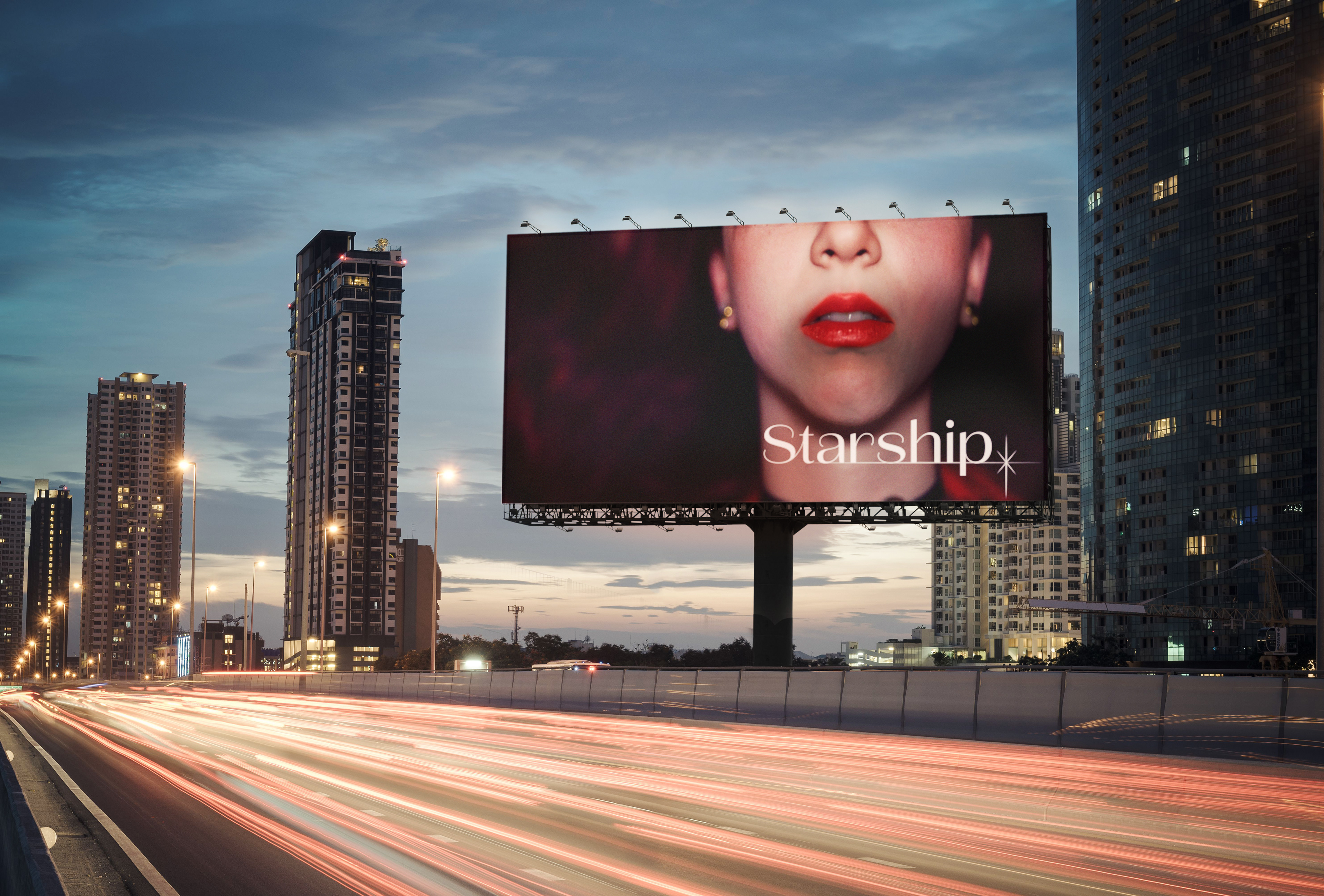
I then created a series of billboard and advertisement mockups to display the new logo in action. The idea was to be subtle enough to not be offensive, while also being clear to existing customers and intriguing to new ones.